Good day, color enthusiasts! 🌈 Let’s tackle a question brighter than a neon sign at midnight: what is the friendliest color psychology? Imagine entering a room and instantly feeling like everyone’s BFF – that’s the power of a friendly hue.
Buckle up, because we’re going on a chromatic journey that promises more warmth than a hug from grandma.
Hues and Howdy-dos:
We’ve all experienced it: the pull of a color that just feels inviting. Whether it’s a restaurant’s warm tones or that one friend’s sunny yellow kitchen, colors have a sneaky way of dictating our mood.
- A brief splash into the world of color emotions:
- Colors aren’t just a treat for the eyes; they tap dance on our emotions. Remember that fiery red? Passionate. And the deep blue? Calm and serene. It’s a color-coded emotional rollercoaster out here!
- But when we talk friendliness, think of open arms or that irresistible puppy face. We’re diving into shades that make you feel seen, loved, and downright chipper.
- Why some colors make us want to break into spontaneous high-fives:
- Human brains are funny things. We’ve evolved to associate certain colors with specific situations or feelings. Pastel blues and soft yellows? They often scream “safe, happy, trustworthy” to our noggin.
- These associations aren’t random. They’re forged through centuries of nature (think sunny skies and calm waters) and nurture (looking at you, cheerful yellow marketing campaigns).
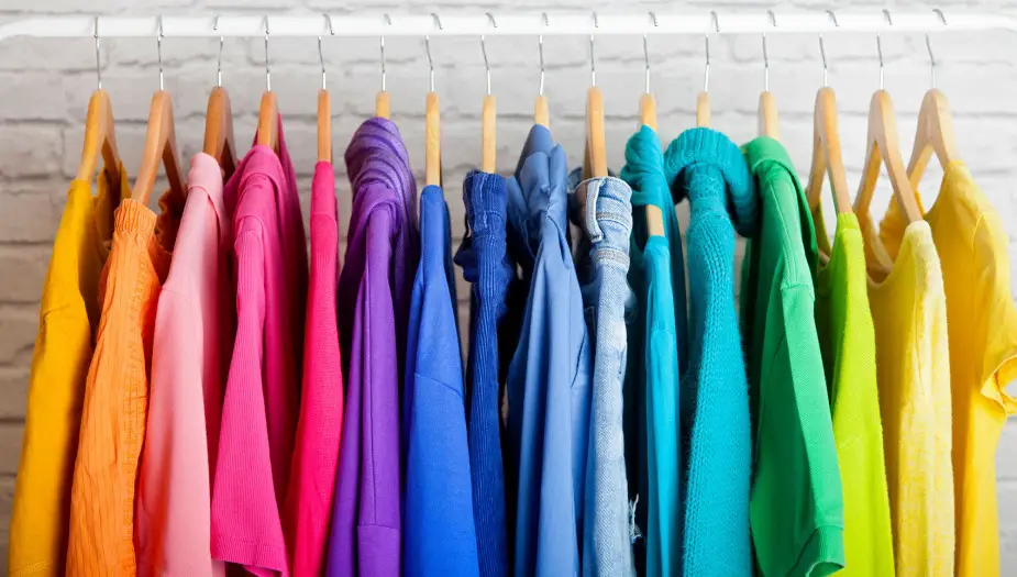
Beyond the Basics: Friendliness in Fibers and Pixels:
Colors don’t just hang out in the background. They’re in our wardrobes, our apps, our favorite websites – pretty much everywhere.
- How colors weave their way into our wardrobe choices:
- Ever worn a bright shirt and felt the world seemed friendlier? That’s not just your radiant personality (though it definitely plays a part). Friendly colors in our attire can act as a beacon of approachability.
- Pastel hues, light blues, soft yellows, and mellow greens often make us feel and appear more open to social interactions. Wear them, and you might just be the life of the party – or, at the very least, the most hugged person in the room.
- Digital dominance: Why certain website colors just feel more… clickable:
- Digital designers are basically modern-day wizards. With a swish and a click, they can guide our eyes and clicks using color.
- Friendly colors aren’t just pleasant to look at; they encourage interaction. Think about social media icons, call-to-action buttons, or even email sign-ups. If they’re in a shade that screams “trust me, I’m friendly!”, you’re more likely to engage.
Colors that Cry (or Laugh) Out Loud:
Before we deep dive into the modern era’s friendly palette, let’s hop into our time machine (seat belts on, please) and see how our ancestors viewed these hues.
- The science behind emotional reactions to colors:
- It all starts in the eye. Light hits the retina, which then sends signals to our brain. But it’s not a straightforward path. Depending on the color, different parts of our brain light up, causing a myriad of reactions.
- Some colors, like those in the “friendly” family, stimulate parts of our brain associated with happiness, safety, and, well, friendliness.
- A whirlwind tour of history: How ancient civilizations viewed friendly colors:
- The Greeks saw yellow as the symbol of wisdom and white as the color of joy.
- Ancient Chinese texts often associate green with harmony and balance.
- Meanwhile, in India, a soft saffron yellow has long been seen as a hue of purity and light.
So, colors, emotions, and history? It’s a tantalizing tango that has led us to today’s friendliest shades. Hold on to your paintbrushes, because we’re about to dive into the specific hues that make our hearts sing and our faces grin! 🎨🌟
The Friendliest Shades: Breaking Down the Palette:
Now, the moment your eyeballs have been eagerly waiting for: which shades actually win the “World’s Most Sociable Color” award? Let’s swirl our paintbrush into the palette.
- The sunshine of yellows: warmth, happiness, and that weekend feeling.
- Bright and sunny, yellow often evokes feelings of joy and optimism. From soft buttercream to vibrant sunflower, each shade has its own level of zing. Lighter hues are associated with peace and calmness, while bolder ones embody energy and excitement.
- Cool blues: Trustworthy, reliable, the ones you’d call after a bad day.
- Blues, especially those of the paler variety, are the unsung heroes of the friendliness brigade. They whisper (never shout) sentiments of trust, loyalty, and understanding. Think of that trusty denim jacket or the soothing evening sky.
- Greens: Nature’s way of saying “You’re welcome here!”
- Ah, greens, the shade of rolling hills and mint choc chip ice cream. They speak of nature, renewal, and balance. Earthy tones like olive or sage are calming, while brighter greens like lime are energetic and youthful.
Marketing’s Most Welcoming Mavens:
Pop quiz: Ever bought something just because the packaging was downright adorable? Yep, the power of friendly colors in marketing. Let’s dive into some genius strategies.
- Why certain brands opt for approachable hues:
- Brands, big and small, know that colors affect purchasing decisions. Friendly colors can humanize a brand, making it feel more relatable and inviting. Consider how tech giants use blues to seem trustworthy or how eco-friendly brands often opt for earthy greens.
- From logos to packaging: the art of inviting consumers in with color.
- Think of brands that use yellow – McDonald’s, IKEA, Snapchat. Notice the pattern? They’re all aiming to be approachable, energetic, and, in some cases, youthful.
- Color isn’t just for logos. It’s in the store layouts, product packaging, and even the uniforms employees wear. Every hue is a chapter in a brand’s story.
Choosing Your Friendly Vibe: Personal and Professional Perspectives:
Whether you’re picking a wall color or rebranding a business, here’s how to channel friendliness like a pro:
- Selecting colors for events that say “Come on in!”
- Organizing a summer BBQ or a community fair? Opt for banners, decor, and invites in shades of soft blue, warm yellow, or pastel greens. They set a tone of inclusivity and cheer.
- Tips for businesses looking to convey warmth and trust:
- Branding matters! From business cards to websites, colors convey your brand’s essence. If approachability is your game, consider friendly colors for logos, staff uniforms, or even office decor.
The Colorful Cocktail Party:
Imagine a soiree where colors were the guests. Fiery reds chatting up cool blues, vibrant oranges slow dancing with deep purples. And in the center of it all? Our friendly hues, hosting, laughing, making every shade feel at home.
Embracing friendly colors isn’t just about aesthetics. It’s an ode to our shared human experience – our desire for connection, warmth, and understanding. In a world that can sometimes feel a tad gray, here’s to splashing around in pools of inviting, friendly hues. To painting our world in the colors of laughter, love, and limitless possibility. Cheers, color-lovers! 🍹🎨🌈