Dive into the world of color psychology as we explore whether yellow, the brightest hue, is truly a source of stress or a ray of sunshine in our lives.
Welcome, fellow color enthusiasts! Today, we tackle an age-old question that has puzzled many: Is yellow a stressful color?
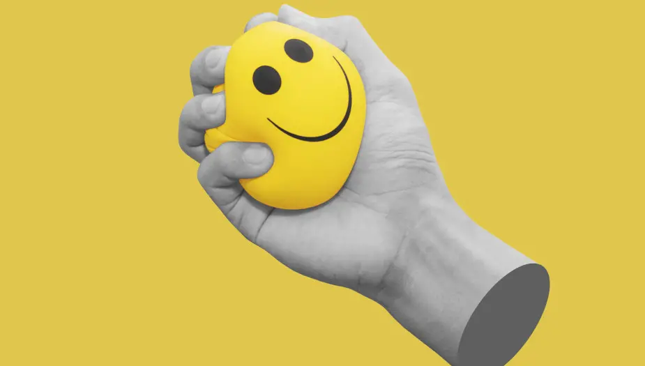
As the hue of sunshine, daffodils, and emojis, yellow holds a special place in our hearts. But does this vibrant shade have a darker side?
Join us as we embark on a colorful journey to discover the truth behind yellow’s impact on our emotions, and whether it truly deserves the title of “stressful hue.”
The Science of Color Psychology
Color psychology is a fascinating field that delves into the complex relationship between colors and human emotions. Research suggests that colors can have a significant impact on our mood, behavior, and even decision-making process. Here’s a quick rundown of what we know about color psychology:
- Emotional associations: Different colors can evoke various emotions and reactions in people. For example, red is often linked to passion and aggression, while blue is associated with calmness and stability.
- Cultural influences: Our perception of colors is heavily influenced by our cultural background. For instance, white is seen as a symbol of purity in Western cultures, whereas it represents mourning in many Eastern societies.
- Personal experiences: Individual experiences and memories also play a crucial role in shaping our emotional response to colors. A person who has positive associations with yellow may find it uplifting, while another may associate it with stress due to a negative past experience.
Yellow: A Brief History

Yellow has a rich and varied history across different cultures and time periods. Let’s take a brief tour through some of the most notable moments in yellow’s colorful past:
- Ancient civilizations: In ancient Egypt, yellow was associated with gold, which symbolized eternal life and divine power. Meanwhile, in ancient China, yellow was considered the color of the emperor and was used to represent authority and nobility.
- Middle Ages: During the Middle Ages, yellow took on a more sinister connotation in Europe, as it was often used to mark individuals who were considered outcasts, such as Jews or those accused of heresy.
- Modern era: In contemporary times, yellow has regained its positive image, thanks in part to its association with sunshine, happiness, and positivity. It has become a popular color in fashion, art, and design, as well as a powerful tool for marketers.
Sunny Side Up: The Positive Side of Yellow
Despite its tumultuous history, yellow has a plethora of positive connotations that make it a popular choice for various applications. Here are some of the key psychological benefits associated with the color yellow:
- Happiness: As the color most closely associated with sunshine, yellow is often seen as a symbol of happiness, warmth, and optimism. It has been shown to evoke feelings of joy and cheerfulness in people, making it a popular choice for spaces meant to inspire positivity.
- Energy: Yellow’s bright and vibrant nature can help boost our energy levels and stimulate mental activity. It is believed to encourage communication, creativity, and focus, making it an ideal color for workspaces and learning environments.
- Attention-grabbing: Due to its high visibility, yellow is effective at capturing attention and making a statement. This makes it a popular choice for safety gear, traffic signs, and advertising materials that need to stand out.
In the next sections, we will delve deeper into the potential downsides of yellow and explore how to strike the perfect balance between its uplifting and stressful aspects.
Not-So-Mellow Yellow: When the Sunny Shade Turns Stressful

While yellow has many positive associations, it’s not all sunshine and daffodils. In certain contexts, this vibrant hue can evoke feelings of stress and anxiety. Let’s explore some instances where yellow may not be as mellow as we’d like:
- Overstimulation: Yellow’s high visibility and energy-boosting properties can sometimes backfire, leading to overstimulation and restlessness. This is particularly true in environments where large amounts of yellow are used or when coupled with other bright colors.
- Warning signs: Yellow is often used to signify caution or warn of potential danger (think traffic signs and hazard symbols). As a result, exposure to yellow in these contexts can trigger feelings of unease and stress.
- Negative cultural connotations: In some cultures, yellow carries negative connotations, such as deceit or cowardice. For individuals from these backgrounds, the color may evoke negative emotions and associations.
Factors Influencing Yellow’s Emotional Impact
As we’ve seen, yellow can have both positive and negative effects on our emotions. But what factors influence whether we perceive yellow as uplifting or stressful? Here are some key considerations:
- Personal experiences and associations: Our individual history with the color yellow plays a significant role in shaping our emotional response to it. If you associate yellow with happy memories or positive experiences, you’re more likely to find it uplifting. On the other hand, if you’ve had negative experiences with yellow, it may be more likely to cause stress.
- Shades and combinations: The specific shade of yellow and the colors it’s paired with can also impact our perception. For example, a soft, pastel yellow may feel more calming, while a bright, neon yellow could be more jarring. Combining yellow with complementary colors, like blue or green, can help balance its intensity and create a more harmonious effect.
Harnessing the Power of Yellow in Marketing
Given its attention-grabbing nature and potential to evoke strong emotions, yellow can be a powerful tool for marketers. Here are some tips and examples of how to use yellow effectively in your marketing campaigns:
- Create contrast: Use yellow as an accent color to draw attention to specific elements or call-to-actions in your advertising materials or website design.
- Evoke positivity: Incorporate yellow into your branding or packaging to convey a sense of happiness, optimism, or warmth.
- Stand out from the competition: If your competitors primarily use cool colors like blue or gray, incorporating yellow into your brand identity can help you stand out and create a memorable impression.
Examples of successful yellow branding and advertising include McDonald’s golden arches, IKEA’s iconic logo, and Snapchat’s eye-catching app icon.
Finding Balance: The Yin and Yang of Yellow
To make the most of yellow’s vibrant energy without tipping into stress territory, it’s essential to find the right balance. Here are some strategies for embracing the complexity of this intriguing hue:
- Use sparingly: Avoid overwhelming your audience with too much yellow by using it as an accent color or combining it with more calming hues.
- Consider context: Be mindful of the context in which you’re using yellow and any potential negative associations it may have for your target audience.
- Experiment with shades: Explore different shades of yellow to find the one that best suits your desired emotional impact and complements your overall color scheme.
While yellow can indeed be a stressful color in certain situations, it also has the power to uplift, energize, and capture attention.
By understanding the nuances of yellow’s emotional impact and using it thoughtfully in your marketing campaigns, you can harness its potential to create memorable and engaging experiences for your audience.